Coffee Shop Sales Dashboard | YTD 2026
Project Overview:
As part of my data analytics portfolio, I designed an interactive Power BI Sales Dashboard to analyze the performance of a coffee shop business across sales, transactions, units sold, products, stores and customer purchasing patterns.
The dashboard provides a YTD 2026 view of business performance, with a focus on comparing current-year results against the previous year. It also allows users to explore sales trends by month, day, time, store, product category and individual products, making it easier to identify peak periods, top-performing products and areas that may require attention.
Key Features:
- Interactive KPI Cards: Total sales, number of transactions, units sold and average transaction value with year-over-year performance indicators.
- Sales Performance Analysis: Monthly comparison of current-year and last-year sales to identify growth and declining periods.
- Store Performance: Comparison of sales and units sold across different store locations to identify the strongest-performing branches.
- Product Category Analysis: Breakdown of sales across Coffee, Tea, Bakery, Drinking Chocolate, Coffee Beans, Loose Tea and other categories.
- Peak Time Analysis: Calendar and hourly heatmap showing the days and times with the highest sales activity.
- Top & Bottom Products: Identification of the top-performing and lowest-performing products based on current-month sales and year-over-year changes.
- Interactive Slicers: Store and product filters allow users to dynamically explore specific areas of the business.
- Monthly Analysis View: Detailed analysis of daily sales performance and peak selling periods.
- Professional Dashboard Design: Clean, light-themed layout with consistent visual hierarchy, KPI indicators, conditional formatting and intuitive navigation.
Interactive Dashboard
[Power BI dashboard embedded here]
Insights and Analysis:
- Strong Overall Sales Performance: YTD sales reached approximately 723K, with current-year sales showing an 8.3% increase compared with the previous year.
- Transaction Growth: The business recorded approximately 149K transactions, representing a 10.1% increase year-over-year.
- Unit Sales Increased: Approximately 214K units were sold, up 8.7% compared with the previous year.
- Stable Customer Spending: Average transaction value was approximately 4.85, slightly below the previous year’s 4.94, indicating that sales growth was driven more by transaction volume than higher average spending.
- Store Performance: Lower Manhattan generated the largest share of sales at approximately 50.2%, followed by Hell’s Kitchen and Astoria.
- Coffee Remains the Leading Category: Coffee generated approximately 280K in sales, making it the strongest product category, followed by Tea and Bakery.
- Positive Monthly Trend: Most months showed year-over-year sales growth, with particularly strong performance in February, April, and June.
- Peak Selling Periods: The daily and hourly analysis highlights specific periods with consistently higher sales activity, providing opportunities for better staffing, inventory planning and promotional scheduling.
- Product-Level Opportunities: The Top 5 and Bottom 5 analysis makes it easier to identify products with strong growth as well as products experiencing declining sales.
Technical Skills Applied:
- Power BI – Dashboard development, visualization, KPI cards, slicers, and interactive navigation
- DAX – Sales calculations, year-over-year comparisons, percentage changes, averages and ranking measures
- Data Cleaning & Transformation – Preparing transaction-level data for analysis and reporting
- Time Intelligence – Monthly, daily and hourly sales trend analysis
- Data Visualization – Selecting effective charts for sales, product, store and time-based analysis
- Conditional Formatting – Highlighting positive and negative performance changes
- Analytical Storytelling – Translating sales data into actionable business insights
- Dashboard UX Design – Creating a clean and user-friendly reporting experience
Impact:
This dashboard provides coffee shop management with a single, interactive view of sales performance and customer purchasing behavior. It can support better decisions around staff scheduling, inventory planning, product management, store performance, promotions and sales strategy.
Overall, the project demonstrates how Power BI can transform transaction-level sales data into a practical business intelligence solution, helping decision-makers move from simply tracking sales to understanding when, where and what customers are buying.
Cable Manufacturing Dashboard | YTD 2026
Project Overview:
As part of my data analytics portfolio, I designed a comprehensive Power BI dashboard to monitor and analyze the performance of a cable manufacturing business across sales, production, quality, delivery, cost and profitability. The dashboard covers YTD 2026 performance from January to August 2026, with comparisons against the previous year to highlight key trends and business opportunities.
The dashboard provides an interactive view of performance by month, emirate, product, color, orders, production output, quality rating, delivery lead time, manufacturing cost and profit, supporting data-driven decision-making across different business areas.
Key Features:
- Interactive KPI Cards: Total orders, production output, sales revenue, manufacturing cost, gross profit, gross margin, quality rating, delivery lead time and production efficiency.
- Year-over-Year Analysis: Comparison of current-year and last-year performance to quickly identify improvements, declines and significant changes.
- Production Performance: Analysis of production output by product, month and emirate, helping identify production trends and high-performing markets.
- Sales & Revenue Analysis: Breakdown of sales revenue by product, color, month and emirate to understand revenue contribution and market performance.
- Cost & Profitability Analysis: Monitoring of manufacturing cost, cost per meter, profit per meter, gross profit and gross margin.
- Quality & Delivery Monitoring: Analysis of quality ratings and delivery lead times by month and emirate to identify areas requiring operational improvement.
- Interactive Dashboard Navigation: Separate views for Sales Overview, Production Performance and Quality & Delivery allowing users to explore different aspects of the business.
- Light-Themed Dashboard: Clean and professional design with consistent KPI cards, charts, tables, conditional formatting and interactive filters for executive-level reporting.
Interactive Dashboard
[Power BI dashboard embedded here]
Insights and Analysis:
- Overall Order Volume Declined: The dashboard recorded 214 orders, compared with 229 in the previous year, representing a 6.6% decrease.
- Production Remained Relatively Stable: Production output reached 22.72K meters, only 1.8% lower than the previous year’s 23.14K meters despite the decline in order volume.
- Improved Production Efficiency: Average production per order increased to 106.16 meters/order, up 5.1% compared with the previous year, indicating better output per order.
- Fiber Optic Leads Production: Fiber Optic contributed approximately 44% of total production output, making it the largest product category, followed by Coaxial and Twisted Pair.
- Revenue Remained Strong: YTD sales revenue reached approximately AED 6.15M, while gross profit reached AED 3.33M, resulting in a healthy 54.23% gross margin.
- Regional Performance: Ajman, Dubai, and Abu Dhabi were among the strongest contributors in terms of sales and production volume, highlighting the importance of these markets.
- Quality Performance: The overall average quality rating was 3.09/5, relatively stable compared with last year’s 3.10. However, the variation across emirates highlights opportunities for targeted quality improvement.
- Delivery Lead Time: Average delivery lead time increased slightly to approximately 11.1 days, compared with 10.9 days last year, suggesting an opportunity to improve delivery efficiency.
- Cost and Profitability: Manufacturing cost per meter was approximately AED 123.82, while profit per meter reached AED 146.68, providing a clear view of production economics and profitability.
- Monthly Performance Fluctuation: Several months showed significant year-over-year changes in production output and sales revenue, making monthly trend monitoring important for identifying demand and operational patterns.
Technical Skills Applied:
- Power BI – Dashboard design, data modeling, visualization, KPI development and interactive slicers
- DAX – KPI calculations, year-over-year comparisons, percentages, averages and profitability metrics
- Data Cleaning & Transformation – Preparing and standardizing data for reporting and analysis
- Data Visualization – Selecting appropriate charts and visual elements for operational and management reporting
- Conditional Formatting – Highlighting performance changes, quality ratings and key business indicators
- Analytical Storytelling – Converting operational and financial data into meaningful business insights
- Dashboard UX Design – Creating a clean, consistent and user-friendly executive reporting experience
Impact:
This dashboard provides management with a single view of sales, production, quality, delivery, cost and profitability performance. It helps identify performance gaps, monitor year-over-year trends, understand regional and product contributions, and support more informed decisions around production planning, quality improvement, delivery performance and business growth.
Overall, the project demonstrates how Power BI and data analytics can transform manufacturing data into a practical management tool for continuous improvement and data-driven decision-making.
Project Objective
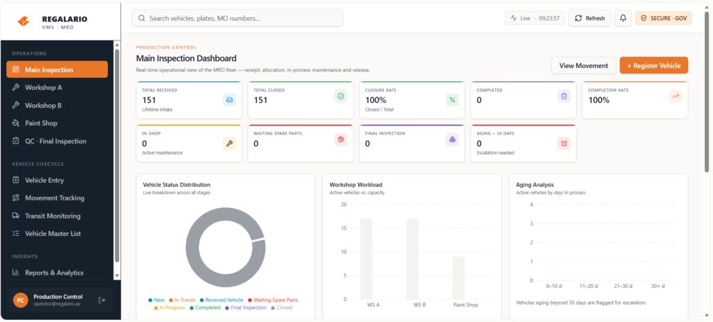
The main objective of this initiative is to transform vehicle monitoring from a manual process into a centralized and efficient monitoring system that provides better visibility of vehicle movement throughout operations.
The system is designed to monitor vehicle status from:
- Vehicle receiving
- Main inspection
- Workshop transfer
- Repair progress tracking
- Vehicle completion and closure
Key Features
- Real-time vehicle movement monitoring
- Centralized tracking dashboard
- Workshop and bay monitoring visibility
- Vehicle status updates and progress tracking
- Improved coordination between Production Control and workshops
- Reduced dependency on manual verification processes
Operational Impact
This initiative aims to support operational efficiency by:
- Reducing manual monitoring activities
- Improving accuracy of vehicle tracking
- Enhancing communication and coordination between teams
- Providing faster access to vehicle status information
- Supporting better operational decision-making through improved visibility
Continuous Improvement Perspective
As an Industrial Engineering professional, I believe that many improvement opportunities come from observing daily operational challenges. Small inefficiencies in routine processes can often lead to meaningful system improvements that enhance productivity, visibility and workflow efficiency.
This project reflects my interest in combining process improvement, operational analysis and digital solutions to support smarter and more efficient operations.
Future Vision
I’m hoping to further present and demonstrate this initiative in the future, although there are currently some operational restrictions and limitations that may prevent full implementation at this stage. Nevertheless, continuous improvement begins with identifying real operational problems and developing practical solutions that create value for the organization.
UAE Higher Education Graduates Dashboard
Project Overview:
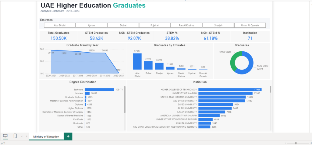
As part of my data analytics portfolio, I designed a comprehensive Power BI dashboard to analyze and visualize trends in higher education graduates across the UAE from 2017 to 2023. The dashboard aggregates data by academic year, degree, institution, emirate, and STEM vs non-STEM classification, providing actionable insights for education policy, workforce planning, and institutional analysis.
Key Features:
- Interactive KPI Cards: Total graduates, STEM vs Non-STEM percentage, top-performing emirates, and total institutions.
- Trend Analysis: Line chart showing graduation trends over the past six academic years, highlighting peaks and reporting gaps.
- Geographic Distribution: Bar chart showcasing graduates by emirate, enabling clear identification of regional education hubs.
- Degree Distribution: Visual breakdown of graduates by academic degree, highlighting the dominance of bachelor’s degree holders and opportunities for postgraduate programs.
- STEM vs Non-STEM Analysis: Donut chart illustrating the STEM skill gap and implications for workforce development.
- Light-Themed Dashboard: Clean, professional design suitable for executive presentations and strategic decision-making.
Insights and Analysis:
- Stable Graduation Trends: Graduates consistently ranged from ~27K–29K per year, with a spike in 2020–2021.
- Regional Concentration: Abu Dhabi and Dubai produce the majority of graduates, indicating concentrated education infrastructure.
- Degree Distribution Imbalance: Bachelor’s degrees dominate (~70% of total graduates) with lower output in postgraduate and specialized degrees.
- STEM Talent Gap: Non-STEM graduates constitute ~61% of total graduates, signaling opportunities to encourage STEM-focused education for future workforce alignment.
Technical Skills Applied:
- Power BI (Dashboard design, data visualization, KPI creation, slicers for interactivity)
- Data aggregation and cleaning for reporting consistency
- Analytical storytelling for insights communication
Impact:
This dashboard supports policy makers, academic institutions, and workforce planners in making informed decisions about education strategy, skills development, and regional talent distribution.
AI Social Media Content Automation Workflow
Project Overview:
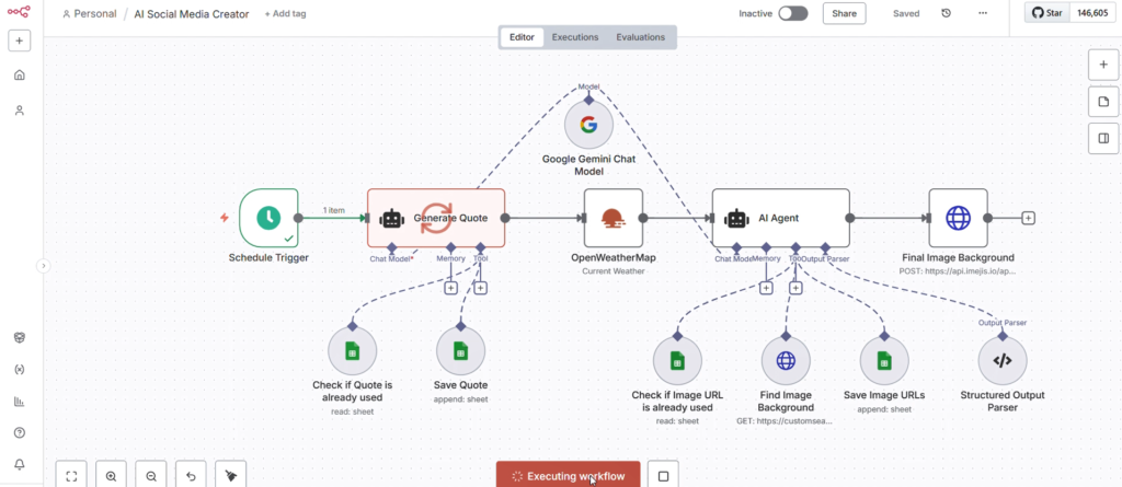
This project showcases an end-to-end AI-powered automation workflow designed to generate and publish engaging social media content. Built using a low-code orchestration platform, the system integrates multiple AI models and APIs to automate quote generation, contextual enhancement and visual content creation—reducing manual effort and ensuring consistent, high-quality outputs.
The workflow consists of the following key components:
- Schedule Trigger
- Automates execution at predefined intervals
- Enables consistent content publishing without manual intervention
- AI Quote Generation
- Uses a generative AI model to create unique, engaging quotes
- Integrated validation ensures no duplicate content via Google Sheets
- External Data Enrichment
- Fetches real-time data (e.g., weather via API) to contextualize content
- Enhances relevance and personalization
- AI Agent Processing
- Combines text generation, reasoning and tool usage
- Selects suitable visual themes and content structure
- Image Generation & Selection
- Retrieves background images via API
- Validates uniqueness to avoid reuse
- Stores image URLs for tracking and reuse prevention
Structured Output Parsing
- Formats output into a standardized schema
- Ensures compatibility with downstream publishing tools
Justinmind Website UI/UX Interface Design
Project Overview
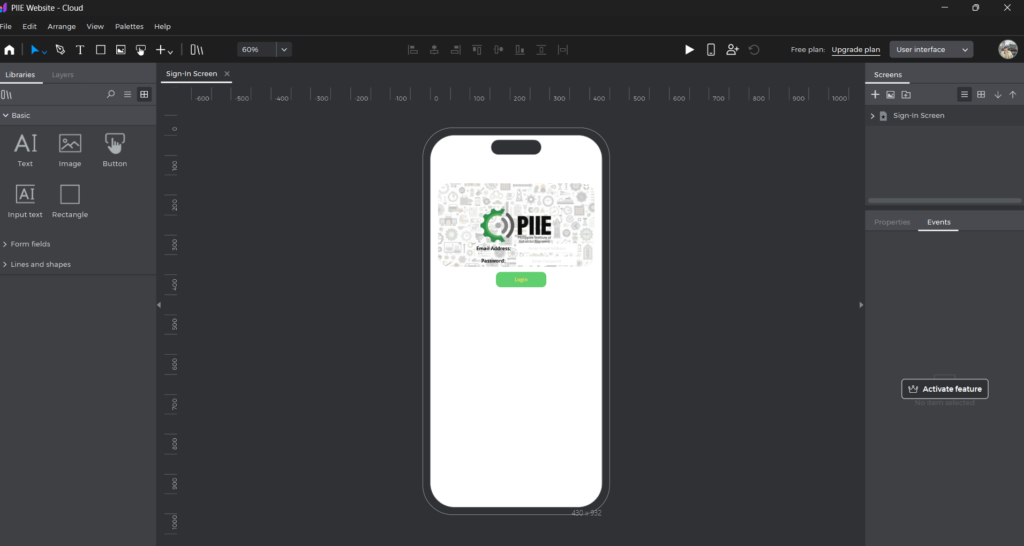
This project focuses on designing and prototyping a responsive mobile interface using Justinmind, aimed at delivering a clean, intuitive and user-centered digital experience. The interface appears to support a dashboard-style application, likely centered around user engagement, activity tracking and quick access to key features.
The goal was to create a seamless interaction flow that balances visual clarity with functional efficiency, ensuring users can easily navigate, access information and perform actions without friction.
Design Objectives
- Create a modern, minimal and scalable UI system
- Ensure intuitive navigation and usability
- Improve information hierarchy and readability
- Provide quick access to key actions and features
- Design a visually engaging dashboard experience
Key Features
1. Dashboard-Centric Experience
- Centralized dashboard presenting:
- User profile overview
- Key metrics
- Activity summaries
2. Quick Actions Panel
- Easily accessible shortcuts for primary user tasks
- Reduces time-to-action and improves efficiency
3. Event Management Section
- Dedicated area for upcoming events
- Clear card-based structure for readability
- Visual indicators for important dates and updates
4. Clean Visual Hierarchy
- Strategic use of:
- White space
- Color accents
- Typography
- Ensures users can scan content effortlessly
5. Mobile-First Design
- Optimized for mobile interaction
- Touch-friendly components
- Smooth scrolling and navigation
6. Consistent UI Components
- Reusable design elements such as:
- Maintains design consistency across screens
Design Highlights
- Minimal and modern aesthetic
- Strong emphasis on usability and accessibility
- Structured layout with clear content grouping
- Balanced visual design with functional interaction
Tools Used
- Justinmind (Prototyping & Interaction Design)
- UI design principles (Typography, Color Theory, Layout Systems)
Outcome
The final prototype demonstrates a user-friendly, scalable and visually cohesive interface, effectively showcasing how thoughtful UX design and interactive prototyping can enhance user engagement and streamline digital experiences.